It was a real pleasure working with Special Educational Needs Advocate, Oliver Chrispin. He was open with us about how family experience drove him to empower children and tackle the hurdles that the school system brings. We needed to design a respectable, yet approachable brand so that he could reach more clients and truly work his magic.
Logo
Design
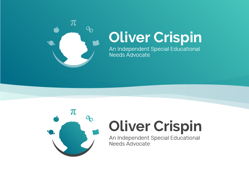
Childhood is supposed to be full of wonder. Where the school system fails, Oliver rectifies. Full of innocence and symbolism, the new logo design captivates the sense of awe that early life is intended for.

Visual
Identity
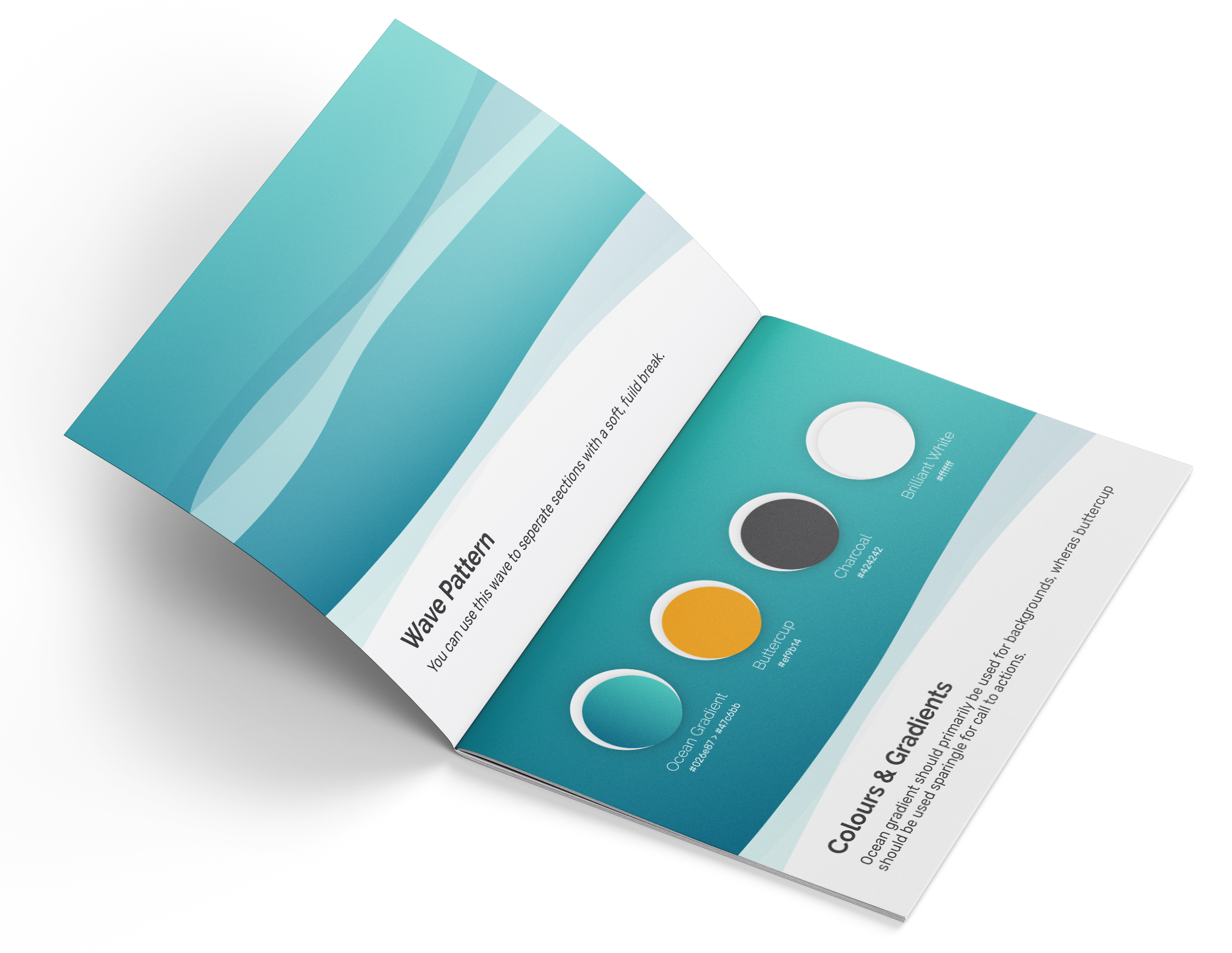
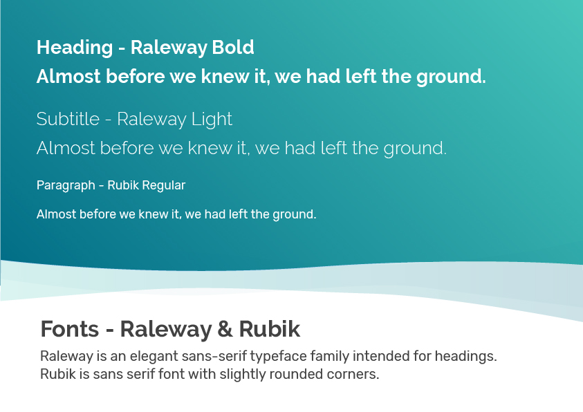
We had a few meetings with Oliver to get a real feel for his mission. Charisma is at the forefront of his work, so the visual identity guide needed to embody Oliver's collected personality and strong business values. Here, we focused on colour theory to get his mission across. Blues are used to illustrate peace and authority, symbolising the journey to tranquillity. The chosen fonts and textures are simple and airy, giving the audience the breathing room they need.
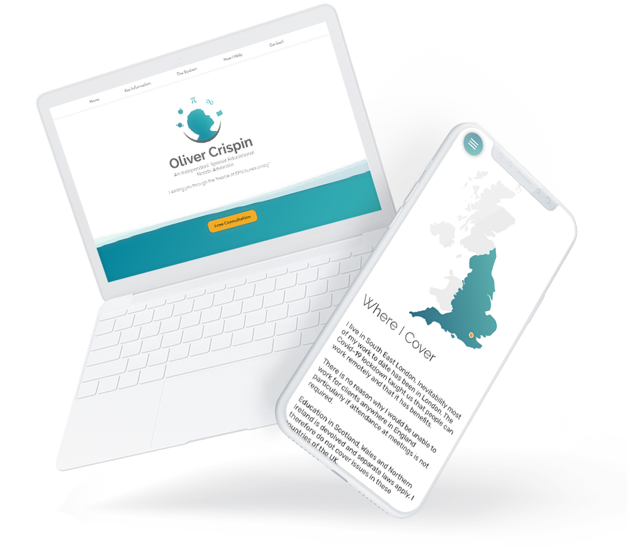
Website
Oliver's website needed to show his expertise and provide useful information on UK SEND practices. Its purpose demanded that it be simple, user friendly and accessible on all devices. We crafted a site featuring clear navigation and generous spacing to reflect the business values.